Java Technology Home Page
Downloads, APIs, Documentation
Java Developer Connection
Docs, Tutorials, Tech Articles, Training
Online Support
Community Discussion
News & Events from Everywhere
Products from Everywhere
How Java Technology is Used Worldwide


TSC Contents
Front Page
Article Index

Related Links
JFC Home
Download J2SE
J2SE 1.4 Release
Notes for Swing
Java Tutorial
Java Web Start
Swing Sightings

Sign up for email
notification


 Article Table of Contents 
    
 Introduction 
  What is TableLayout? 
  Creating a TableLayout 
    
 Column and Row Sizes 
  Absolute and Scalable Space 
  Order of Allocation 
  Rounding Considerations 
    
 Cells 
  Adding Components 
  Justification 
  Multiple Cells 
    
 Final Theory 
  Dynamic Rows and Columns 
  Preferred Layout Size 
  Onward 
    
 Examples 
 Simple 
  GridLayout Comparison 
  GridBagLayout Comparison 
  A Typical GUI 
  Preferred Rows and Columns 
  TableLayoutConstraints 
  A RAD Tool 
    
 API Reference 
 Download 
Help pagesA-Z Index

The Source for Java Technology


A Simple Example

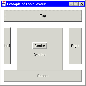
The following code creates the simple TableLayout shown below.

package example;


import java.awt.*;
import java.awt.event.*;
import layout.TableLayout;


public class Simple
{


    public static void main (String args[])
    {
        // Create a frame
        Frame frame = new Frame("Example of TableLayout");
        frame.setBounds (100, 100, 300, 300);

        // Create a TableLayout for the frame
        double border = 10;
        double size[][] =
            {{border, 0.10, 20, TableLayout.FILL, 20, 0.20, border},  // Columns
             {border, 0.20, 20, TableLayout.FILL, 20, 0.20, border}}; // Rows

        frame.setLayout (new TableLayout(size));

        // Create some buttons
        String label[] = {"Top", "Bottom", "Left", "Right", "Center", "Overlap"};
        Button button[] = new Button[label.length];

        for (int i = 0; i < label.length; i++)
            button[i] = new Button(label[i]);

        // Add buttons
        frame.add (button[0], "1, 1, 5, 1"); // Top
        frame.add (button[1], "1, 5, 5, 5"); // Bottom
        frame.add (button[2], "1, 3      "); // Left
        frame.add (button[3], "5, 3      "); // Right
        frame.add (button[4], "3, 3, c, c"); // Center
        frame.add (button[5], "3, 3, 3, 5"); // Overlap

        // Allow user to close the window to terminate the program
        frame.addWindowListener
            (new WindowAdapter()
                {
                    public void windowClosing (WindowEvent e)
                    {
                        System.exit (0);
                    }
                }
            );

        // Show frame
        frame.show();
    }


}
                

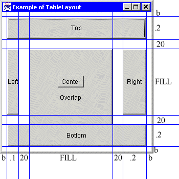
The image on the far left is a snapshot of the frame created with the above program. The image on the near left is the snapshot with lines added to show where the row and column border are. The column widths are shown on the bottom, and the row heights are shown on the right.

As you can see, this example uses TableLayout to create a border of b pixels around the controls. This is an effective technique to create a "insets" in a container that has none. Since b is just a double with a non-negative integer value, the border can be made any size.

This example also shows how to put spaces between components. In this case, a space of 20 pixels horizontally and vertically separates most of the buttons. Some layout managers require the use of "padding" components to accomodate blankspace. With TableLayout, you need only specify a row or column size and place no component in that row or column.

The left and right buttons occupy a single cell and are always the same size as the cell. The top and bottom buttons each span five cells. It is just as easy to make the top and bottom buttons single celled and the left and right buttons multicelled. TableLayout can be used anywhere you would use BorderLayout by creating a grid similar to the one shown in this example. Furthermore, you will have more flexibility with TableLayout.

The button labeled "center" is both in the center cell and is center justified. For this reason, the button is allocated it's preferred size. If the frame is made very small, the "center" button will shrink. But it will never be larger than it's preferred size, no matter how large the frame is.

The button labeled "overlap" is partly obscured by the center button and the bottom button. Since the overlap button was added last, it is on the bottom of the z-order.

Due to the column and row sizes specified, the top button will always have the same area as the bottom button, and the right button will always be exactly twice the size of the left button.

Previous | Next